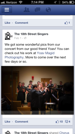
The old style of like/comment buttons and associated counts.
Facebook updated its iOS app recently, including changes to the “Like” and “Comment” buttons on posts. Previously, the buttons looked a lot like HTML links, just as they do if you use Facebook in a web browser. Small, colored icons appeared to the right indicating number of times the post had been “liked” and the number of comments. If there were no likes or no comments, the icons were simply absent, meaning that the mere appearance of the icons encouraged users to tap on them. Doing so quickly displayed the comments and other information about the post.
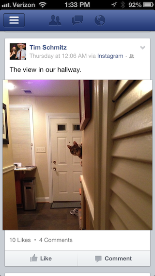
The new version with comments and likes obscured.
The new version of the app replaces the HTML-style links with bigger gray buttons. The increased size makes them easier to hit, and they turn blue if you’ve liked or commented the post. However, the number of likes and comments is bizarrely obscured in small, light-weight, gray text above the buttons. It’s no longer apparent at a glance that people have commented on a post, which in turn discourages users from reading the comments. The tap targets are also fairly small. For a social networking site whose whole business is predicated on getting people to view and interact with posts, this is a strange and baffling choice.
Facebook has long seemed like a company that doesn’t really “get” mobile. It took a long time for them to release an iOS app, and for years it was hampered by a slow, buggy, HTML-5 based design. This latest change doesn’t bode especially well for the future, either.