Introducing Manifest 4

Today I released Manifest 4.0, probably the biggest update Manifest has ever had. There are lots of additions and improvements, but the two biggest are better scheduling and task tracking.
Scheduling

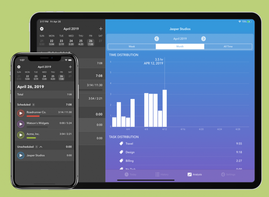
Each day, Manifest generates a custom daily agenda based on your project schedules and progress toward your goals. You can customize which days of the week you plan to work on each project, and Manifest uses those settings to show you which projects you should work on each day. You’ll see a Scheduled and Unscheduled section on Manifest’s main screen, each populated with projects appropriate for the day. For instance, if you set up a project for Fridays, it’ll show up in the Scheduled section each Friday until you reach your time tracking goal, and in the Unscheduled section every other day.

As with many of Manifest’s features, scheduling originated with my own time tracking needs. During development, I’ve found the new daily agenda to be really helpful in keeping my projects on track. Manifest not only tracks my time, but makes it much easier to plan my time as well. I hope you’ll find these new scheduling features as useful as I do.


Tasks

One of the features I get asked about most is task tracking, and I’ve added it in Manifest 4. You can add a task to any previous or current timer, and tasks can be used across multiple projects. You can view a breakdown of tasks for a day, week, month, or all time, within a single project or across all projects. My hope is to make task tracking as flexible as possible so that it fits a wide variety of use cases.

Other features and enhancements

  • Better History View: History has a new planner view that shows how you spend time throughout the day like a day planner. The planner view makes it easy to see how your day went at a glance, where you have gaps or bounced around between projects. You can also view a simple list view of each time session. In either view, tap a session to edit start and stop times, project, task, and notes. You can also manually add time by tapping the + button in the upper right.
  • Keyboard Shortcuts: Manifest 4 adds some simple keyboard shortcuts for navigating the app with a hardware keyboard. I plan to add more keyboard commands in the future, but for now these are a helpful start.
  • Settings Sync: In Manifest 4, your app settings sync via iCloud in addition to your time tracking data, which helps keep all your devices in alignment.
  • Improved Watch app reliability: The Apple Watch can be a tricky beast to develop for, and Manifest 4 should improve the speed and reliability of starting and stopping timers from your watch. I plan a number of improvements to the watch app in the near future to make it more functional, but I didn’t want to delay these quality of life improvements any longer.

I’m really excited to get this update out in the wild. I’ve been living with it for a couple of months now and I can’t imagine going back. I hope you enjoy it and would love to hear your feedback if you have requests or suggestions. Feel free to reach out on Twitter at @manifest_iOS or feedback@tapandtonic.net. I’d love to hear from you!

If you’ve never used Manifest before, you can download and try it for free from the App Store.
Manifest 3.0

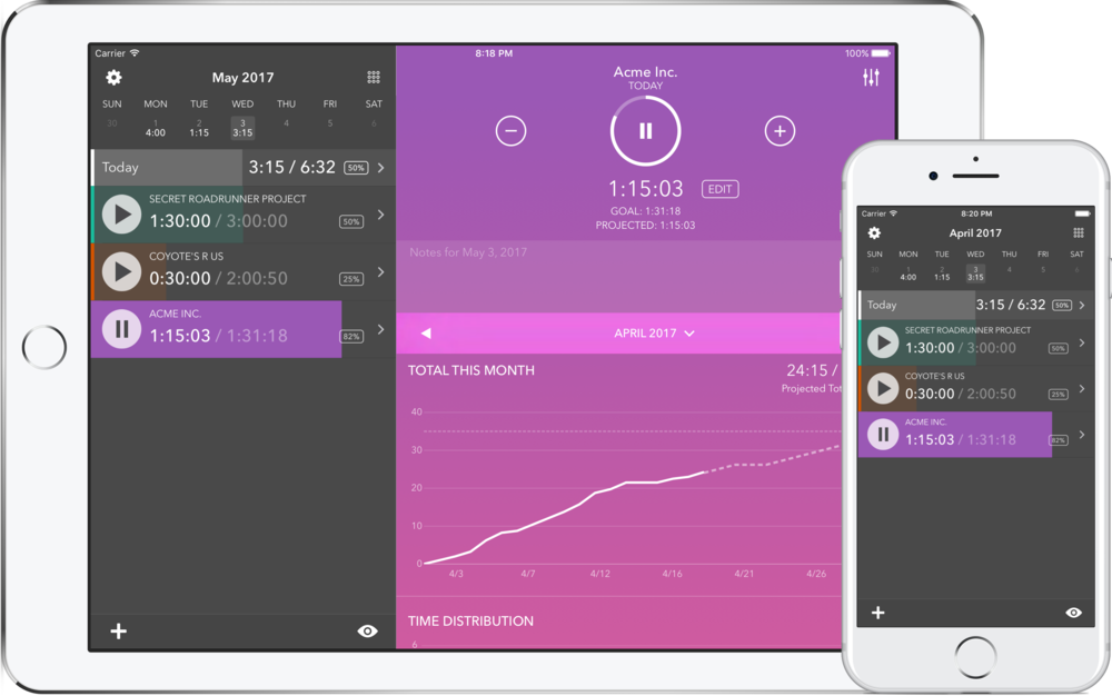
Today I released Manifest 3.0, which brings Manifest’s goal-focused time tracking to the iPad. A big reason I added sync to Manifest a few months ago was to support an iPad version as well. After all, it wouldn’t be very useful to have Manifest on multiple devices if you couldn’t easily share data between them. With sync in place, I was able to design a great iPad app that takes advantage of that big screen.

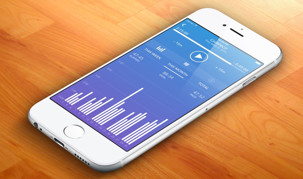
On the iPad, you can keep an overview of your day on the left-hand side and also dig down into additional detail about each project on the right. On both iPhone and iPad, Manifest 3.0 includes updated charts that show how much time you’ve tracked and whether you’re on pace to reach your goals.

Manifest 3.0 also adds a new multi-project view that shows all of your projects on the same chart. It’ll give a day-by-day breakdown of which projects you worked on, as well as chart overall time across all projects. This is a feature I’ve wanted to add for a while, and I’m excited to finally get it into users’ hands.

This version also combines a list of your active projects with a calendar view. Tapping on a day in the calendar makes it easy to add or adjust time for past days, which was a frequently-requested feature. (This was actually possible in previous versions of Manifest, but it wasn’t very obvious how to do it.) The calendar can also be toggled between a week and month view.

Manifest 3.0 also has new options for how to display the list of projects. You can change the sort and switch from ascending to descending, as well as toggle the display of notes and archived projects.

I’m really excited about this release, and it opens up lots of possibilities for the future. You can download a copy and try it for free on the App Store. As always, I’d love to hear your feedback or feature requests by email or on Twitter. If you enjoy Manifest, please consider rating it on the App Store.

Comparing Podcast Apps: Overcast and Castro

I listen to a lot of podcasts, and the app I use for podcasts is one of the most frequently used apps on my phone. For the last couple of years, that’s been Overcast. Recently I decided to give another app, Castro, a spin to see what else was going on in the podcast app world.

Castro

My favorite feature of Castro, by far, is how it manages your play queue. When a new episode is released for one of your subscribed podcasts, Castro places the episode in the Inbox. From there, you can quickly play the episode, add it to the beginning or end of your play queue, or archive it. This ends up being a fantastic solution for podcasts where you don’t want to listen to every episode. For example, I generally skip over episodes of The Incomparable that discuss a movie or book I’m not familiar with, but I don’t want to miss an episode about Star Wars. (Fortunately for me, there tend to be lots of those.) Castro makes that easy: as each new episode arrives in my inbox, it’s quick and easy to either archive it or add to my queue.

I did find navigation in Castro to be a little tricky. At the very bottom of the screen is a row of buttons with play controls: play/pause, skip forward and back, that sort of thing. Above it is another row of buttons representing tabs in the main interface. There’s a tab for your queue, the inbox, archive, and search for adding new podcasts. Although the two rows are visually separated by very different background colors, I found myself having to stop and think a bit about where to look for the button I wanted. To be honest I’m a little surprised by my own confusion, because the layout seems logical, but for whatever reason, it doesn’t quite click with my brain.

After using Castro for a bit, I also discovered that I really missed a few unique features from Overcast.

Overcast

The thing that really sets Overcast apart is how it processes and plays the audio itself. Specifically, it has two key features: Smart Speed and Voice Boost. Smart Speed cuts out little bits of time when there’s silence in an episode. Even though each slice is very small, it can really add up. An hour-long podcast might take only 55 minutes to play. The feature is also pretty clever about not trimming too much, thereby maintaining the pace and feel of each episode.

Maybe even more crucial for me is Voice Boost, which evens out volume differences between different people’s voices. I often listen to podcasts in environments with other noise: on the subway, while cooking or washing dishes, etc. Voice Boost really helps keep everybody at an audible volume without making one person’s voice painfully loud. In fact, I’ve come to rely on Voice Boost without even knowing it. I started listening to a recent episode of Upgrade in Castro and thought something had gone wrong before I realized that I was used to hearing the show in Overcast.

I’ve also come to rely on Overcast’s support for podcast chapters. As far as I can tell, Castro doesn’t support chapters, and I miss them when I use it. I don’t skip around in podcasts all that much, but I occasionally find it handy to know how much time is left in a particular segment, or breeze past something that doesn’t interest me.

On the other hand, Overcast’s episode management isn’t especially noteworthy. Smart playlists get me part of the way there, but now that I’ve been exposed to Castro’s sublime inbox concept, I really miss it. The most recent major version of Overcast added some new queue management tools that help a bit, but it’s still not quite the same. (If Overcast’s smart playlists could include or exclude the contents of other playlists, it might be possible to set up an inbox-type system.)

For now, I think I’m sticking with Overcast. While I absolutely love Castro’s organizational system, I can manage to work with Overcast playlists to come up with something that works pretty well. Conversely, there’s no real equivalent to Smart Speed and Voice Boost in Castro, and I really got used to them. It’s too bad that there isn’t one single app with all of these features, but it’s great to see so many interesting and useful innovations in podcast apps. I’d heartily recommend either one of these apps to anyone looking for a new podcast client.

Manifest 2.3: Introducing Sync

I’m very pleased to announce the release of Manifest 2.3, which has one key new feature: sync. Until now, Manifest has stored its data locally on the iPhone, and that worked fine most of the time. But if you deleted the app, your data was just gone. Sync changes that. By syncing data into the cloud, Manifest can restore your data from the cloud on a new device or after deleting and reinstalling the app.

Manifest uses Apple’s CloudKit to store data in your private iCloud account. Using CloudKit means there’s no separate account to create or configure, and no new passwords to remember. If you’re already signed into iCloud on your phone, you’re good to go.

CloudKit also protects your privacy. Unlike other web services, not even the developer (that’s me!) has access to your private data. The only way to get at your data is by signing in to your iCloud account with your credentials.

Sync also enables a lot of new possibilities for the future. Storing data in the cloud unlocks the potential of multiple devices. I plan to add iPad support in the near future, and possibly a Mac app down the road as well.

Of course, sync in Manifest is optional. When you first launch Manifest 2.3, you’ll be asked if you want to enable sync. If you’d like to keep your data on your device, just tap Not Now and you can continue using the app the way you always have. If you change your mind later, sync can be switched on or off on the Settings screen.

As anyone who’s tried to implement sync knows, it can be a tricky business. There are lots of conditions and edge cases to consider: airplane mode, flaky connections, conflicting data, and more. I’ll be honest: it’s a little scary. I care deeply about providing a great experience, and I’ve spent the past several months making sure Manifest has a solid sync system that deals with these situations sensibly. That said, there are probably some rare circumstances that I haven’t considered, so if you encounter the app doing something you don’t expect, please let me know.

If you haven’t tried Manifest already, you can download it from the App Store. Thanks for trying it, and I hope you enjoy!

WWDC 2016 First Thoughts

The first day of WWDC is in the books, and I jotted down a few first impressions before I get too into the technical sessions later this week.

Siri

Although I’m happy there’s finally a developer API for Siri, I’m disappointed that it’s limited to a fairly small set of applications for now. As a user, what I want most is for my favorite shopping and to-do list apps to get Siri integration, something that won’t be possible with what Apple announced today. However, they strongly implied that Siri API support will expand to other situations in the future. It’s also notable that the API works across all languages that Siri supports, and allows users to interact with much more flexible syntax than something like the Amazon Echo.

It looks like I was wrong about the Siri API being cloud-based, and Apple didn’t say much about how Siri features will work across devices. I assume that each device will only support features for the apps it has installed. I hope they’ll do something about the problem of multiple devices answering whenever I say “Hey, Siri,” especially now that Siri lives on the Mac as well.

MacOS Sierra

I always had a fondness for the classic “Mac OS” name, and I’m happy to see it return, even with slightly odd spacing and capitalization. This year’s code name Sierra may be meant to evoke the Sierra Nevada mountains, but I can’t help but think of the 90s adventure games I loved so dearly in my youth.

Most of the changes on the Mac strike me as gradual evolutions rather than revolutionary new features, and I’m OK with that. The Mac doesn’t need a ton of new features, it just needs to keep up with the times and other platforms. Siri on the Mac doesn’t strike me as all that Earth-shattering, but can’t hurt and might turn out to be handy here and there. I’m puzzled as to why Siri search results get stashed in Notification Center. Why not a smart Finder window? As someone who rarely opens Notification Center on the Mac, it’s an odd choice.

Auto-unlock, Apple Pay on the web, and universal clipboard are small but handy features. Storing the Documents and Desktop folders in iCloud Drive is really appealing as an idea – get at all your files anywhere – but I’m nervous about reliability. I assume that it’ll be possible to opt out of this feature, and I’ll probably do that for a good while to make sure any bugs are worked out.

iOS 10

Aside from a big overhaul of Messages, the changes in iOS strike me as surprisingly incremental for the 10th version of iOS. Many of the updates, like Maps and the lock screen, look great and will certainly be useful and appreciated. Improvements to search in Photos, including face and object recognition, will be great provided that they work as advertised. I don’t think the redesigned Music app does enough to solve the usability problem in Apple Music, but I’m happy to see Apple keep trying to improve it.

One of the bigger changes is something Apple didn’t really talk about: de-coupling many core apps from iOS itself. Many of the system apps, like Mail, Maps, Compass, etc., can now be uninstalled. Moreover, they’re now downloadable from the App Store. That implies that Apple could also update these apps on a different schedule from iOS itself. For example, they could roll out new features in the Photos app in January, instead of waiting for iOS 11. Whether that’ll happen is an open question, but I hope Apple will take advantage of the flexibility.

Messages was clearly the biggest winner in iOS 10, with a ton of new features and even its own app store. Some of the full-screen messaging effects look pretty annoying, but that should shake itself out sooner rather than later. I particularly like how Messages embeds rich content and previews right into a thread. I suspect we’ll look back on the old mostly-text Messages and think we lived like animals.

Of everything in the event today, I’m most puzzled by the lack of significant upgrades for the iPad, particularly multitasking. The multitasking app switcher, in particular, is such a mess that I can’t believe Apple will go another year without improving it. Even something as simple as adding a search field would go a long way. I’m hoping that this is a feature that just wasn’t quite ready and will appear before iOS 10 launches this fall. Barring that, perhaps it could be a 10.1 or 10.2 feature in early 2017. Here’s hoping.

Apple TV

The only thing that really caught my eye during the Apple TV demo was the single sign on feature for authenticating with your cable provider. It’ll make it much less annoying to download a new video on demand app. That one feature alone should make this a great update.

WatchOS

Apple Watch badly needed a software re-think, and Apple delivered. Gone is the confusing distinction between glances and apps, as is the rarely-used friend picker. Instead, you can now press the side button to see a list of frequently-used apps displayed in a horizontally-scrolling Dock. Apple also claims to have vastly increased the speed of Watch apps. Apple claimed to have improved Watch app speed with WatchOS 2, so I’m reserving judgement until I actually get a chance to use this. “Fast” is a relative term, but like Justice Potter Stewart, I know it when I see it.

Overall, I’m very happy that Apple kept an open mind about the Watch with a willingness to change the things that weren’t working. The updates announced for WatchOS 3 make much more conceptual sense to me, and if they’re anything close to as good as today’s demo they should make the Watch much more pleasant to use. Interestingly, no mention was made of the “honeycomb” home screen, so I guess that it remains even in a de-emphasized state.

Siri, iCloud, and Swift on the Server

WWDC kicks off in just a few days, which means it’s prediction time. This year I’ve got one that’s a little off the wall: Not only will there be an API for Siri, but it’ll be iCloud-based and take advantage of Swift on the server.

Implementing a Siri API this way would solve a number of potential problems, and fits with several converging trends from Apple.

Siri exists on an ever-growing list of Apple devices. It started out as a feature specific to the iPhone 4S, then gradually expanded to subsequent iPhones and the iPad. Then came the Apple Watch and Apple TV, and rumors strongly indicate Siri will arrive on the Mac soon. Users expect Siri to have more or less the same feature set on all these devices, which is pretty much what happens now with its core features.

That gets a little tricky when you consider how and where third-party apps and services could integrate with Siri. Unlike the Apple Watch, which is paired to one and only one iPhone, Siri isn’t a good fit for apps that pair to extensions in their iOS counterparts. For example, if Uber creates a Siri app that allows you to request a car, you’d expect that to work from Siri on your iPad or your Mac just as much as on your iPhone where the Uber app is installed.

To me, the most logical solution is to make the apps server-based. Installing a Siri app would create an association between Siri and your Apple ID. Then Siri could provide that app’s functionality from any device where you’ve signed in with your Apple ID. The app could store your personal data in your private iCloud storage, allowing it to remember things like login credentials. From the user’s perspective, Siri apps might be installed through some kind of Siri App Store, or through a prompt in a native app. Either way, the main logic of the app itself would live on the server, perhaps interacting with local native apps on each device through new API.

Storing Siri app logic on the server also ties in to the steady progress Apple has made in advancing services like CloudKit. Last year Apple added CloudKit JS, which allows developers to connect to CloudKit through other web services. It’s not hard to imagine additional expansion that lets developers configure server-side logic within CloudKit itself, logic that might be perfect for Siri.

Finally, Apple has been working on getting Swift running on Linux, which suggests at least a passing interest in running Swift on the server. Given the company’s strong push to drive Swift adoption, it wouldn’t be a huge surprise to see Apple use Swift as the language of choice for cloud-based Siri apps. Even better, it could provide the start of a framework for running Swift in server environments elsewhere.

This prediction is a wild guess, but if Apple does something along these lines it would create some pretty cool opportunities. Finding a way to coordinate a voice-driven assistant across multiple devices is a problem that most other companies haven’t tackled. It would also be a very Apple-y way of moving further into cloud-based services and pushing developers to adopt Apple’s cloud technologies. I can’t wait until next week to find out whether I’m right or wrong.

Favorite Podcasts

The hubbub over podcasting in the past week or two got me thinking about the shows I enjoy the most. Most of them are from smaller producers, probably not the type of people who get invited to meetings with “leading podcast professionals.” I started making a list of my favorite shows. Many of them are technology- or Apple-related, which shouldn’t be too surprising. Here are the top 10 as of right now:

10. This American Life

It’s a cliche, but This American Life is the show that got me into podcasting. My favorites are the more investigative episodes, but nearly all of the segments are compelling. There’s something reassuring about host Ira Glass’ voice, and many of the episodes stand up to repeated watching. (Which is a good thing, because they occasionally recycle segments or episodes.) It’s a great general-audience show for car trips.

9. The Talk Show

I think it’s fair to say that John Gruber is the single biggest name in Apple punditry. He’s been a consistent, smart, and thoughtful commentator for over a decade, and his podcast The Talk Show has survived through a number of iterations. As enjoyable as the tech commentary is Gruber’s discussion of pop culture, particularly his long series on the James Bond movies with Dan Benjamin. That said, you have to be willing to tolerate Gruber’s unfortunate taste in baseball teams. Go Red Sox!

8. Savage Lovecast

Dan Savage’s relationship and sex advice podcast is one of the first I remember discovering. His advice and commenary are compassionate, sane, and often hilarious. The show usually begins with a “rant,” often on political topics, which is a bonus if you’re a big leftie like me. This probably isn’t a show to listen to in the car with your parents or kids.

7. Under the Radar

On Under the Radar, hosts Marco Arment and (Underscore) David Smith discuss independent iOS development for 30 minutes. Marco and David are both developers I admire a lot, and since we do very similar work, I really enjoy hearing their approaches and perspective. The per-episode time limit is partly a carry-over from David’s previous show Developing Perspective. It can help episodes from getting overly rambling and taking over too much of the listener’s time, but it’s a great show and I sometimes with it were longer!

6. Serial

My feelings about Serial are very dependent on whether we’re talking about Season 1 or Season 2. Like most people, I was totally captivated by the first season, and I’m pleased that the producers have continued reporting on new developments in the case. Season 2, on the other hand, was largely a slog. There were elements that I enjoyed, but for some reason I didn’t find the subject matter all that compelling. Still, I’m looking forward to a third season.

5. Thoroughly Considered

This show started off as an interesting accompaniment to a Kickstarter campaign for Obi, a pet toy then in development by Studio Neat. Unfortunately the Kickstarter campaign didn’t succeed, but the show has continued with Myke Hurley and Studio Neat co-founders Tom Gerhardt and Dan Provost. It’s interesting to hear Dan and Tom talk about a business largely focused on making phyiscal products, since that’s pretty different from what I do. At the same time, the way they run their business makes a lot of sense to me, and I admire their practical and non-buzzword-y style.

4. Upgrade

Upgrade has quickly become one of my favorite shows, despite having a fair amount of topical overlap with others in this list. Jason Snell and Myke Hurley discuss the latest news in technology, particulary (but not always) as it relates to Apple. I’ve been reading Jason’s work since I got interested in the Mac in the 90s, and his experience and attitude make all the difference on Upgrade. He’s been following Apple and technology in general for long enough to put things in perspective, and can be critical without over-reacting or becoming shrill. Jason and Myke have a great rapport as well.

3. Liftoff

I’ve been interested in space for as long as I can remember, and this show with Jason Snell and Stephen Hackett scratches that itch for me. The hosts discuss both space exploration and space science, and are occasionally joined by knowledgeable guests. It’s informative while remaining accessible. Liftoff comes out every two weeks (or “fortnightly”) and is one of the first shows I listen to when it comes out.

2. Startup

I’m a little surprised how much I enjoy this show, given my general antipathy toward typical startup culture. Nonetheless, Startup is very well produced and tells interesting stories. In part, this show strikes a chord with me by following the people behind a business, telling stories about what it’s like to be involved in some pretty unique situations. The most recent season is more one-off stories than a continued narrative arc, and I’m curious to see if that changes how I feel about the show.

1. Accidental Tech Podcast (ATP)

When it comes to Apple-oriented tech podcasts, I think ATP is unquestionably the king. I have no idea if the numbers back that up, but pretty much every Apple nerd I’ve talked to listens to it. Each week, Marco Arment, Casey Liss, and John Siracusa go on a meandering discussion of news in the tech world, particularly as it relates to Apple. All three are knowledgeable on the subject, but the best part of the show is hearing each host’s distinct personality and how they relate to each other. Each show is long and I wouldn’t want it any other way.

Podcasting and Big Media

I’ve felt a creeping sense of dread ever since the New York Times ran its now-infamous article about pocasting. I’m not a podcaster myself, but I do listen to quite a few of them, and the Times article has me worried that things are about to change for the worse. A great many podcasters have responded to the article, including fantastic written responses by Marco Arment, Federico Viticci, and a great discussion between Myke Hurley and Jason Snell (43:11, skip directly to it here).

Those responses did a great job of covering things from the podcaster’s perspective, but there’s something else bothering me as a listener. It’s a feeling that podcasting as it stands today, a medium that I get a great deal of enjoyment from, is about to change for the worse. Regardless of whether Apple or any other company caves to their demands, it’s clear that the Big Media world is coming for podcasts, and that doesn’t sound like a good thing.

Based on the Times article, the changes requested by “Leading Podcast Professionals” won’t do anything to increase my satisfaction as a listener. They’re not about providing me with new features that are currently impossible. They’re all about business. In fact, I think we could boil the requests down to one simple premise: Make podcasts more appealing to advertisers. If the Big Podcast world gets what it wants, they stand to make significantly more money. Users, on the other hand, will get…mostly nothing. User don’t need data or analytics, nor will those things improve our listening experience.

In fact, the only changes I’m likely to see (hear?) as a listener are ones that will make my experience worse. Suppose, for example, that some shows become exclusive to tailor-made podcast clients that provide analytics data that others don’t. That only makes my life harder. Instead of using a big playlist that can play all my shows one after another, I’d suddenly have to switch apps between each one. Even worse, it’s easy to imagine that the big podcast players would love to make it impossible to skip ads. (This is also why I don’t think the streaming-TV future is really all that bright. I’ll take my TiVo, thanks.) Plus, clients run by media companies tend not to be very good. Take a look at streaming video off most TV networks’ web sites, or even using the DVR that comes in your cable box. Not so great.

Of course, it’s possible that making podcasts more lucrative will lead to new podcasts that wouldn’t have been possible without a bigger budget. It’s possible. But I’m already pretty happy with the shows that are available to me today. Frankly, I don’t have a lot of room in my listening schedule for more of them. And as should be obvious by turning on network TV, a big budget is no guarantee of quality.

I’m guessing that most of the shows put out by these big players aren’t really ones I’m interested in. Most of my favorite shows are from smaller (but still great!) producers like Relay FM and The Incomparable. My biggest fear is that if Big Media succeeds in collecting all this data and walling off their shows, ad rates for independent podcasts will plummet, putting their viability in jeopardy.

Fortunately, the Times article makes it sound like Apple wasn’t particularly receptive to the demands of the “Leading Podcast Professionals.” Hopefully that means that independent podcasters are safe for the time being. But the writing is on the wall. There’s nothing to stop the big players from building their own apps and services and walling off their content in them, or making deals with other third-party podcast clients. If they do, the best-case scenario is that enough listeners refuse to follow that open podcasts remain viable.

Improving Apple’s Services Problem with a Single Button

Apple’s online services take a lot of heat for being unreliable. The details have shifted over the years, but the basic form remains the same: Changes made on one device sometimes don’t show up on others. The situation improved somewhat since Apple introduced CloudKit and started migrating apps to it, but problems still occur. It happened to me just recently: I added a note to the Apple Notes app on my iPhone, then switched to my Mac, where Notes was already running. No note. Fortunately, I found a quick fix: I quit the Notes app on my Mac, re-opened it, and bingo – my note appeared.

Quick fix or not, Notes felt broken. When it comes to this type of situation, Apple’s vaunted “it just works” philosophy just…doesn’t work. I assume that re-launching Notes prompted the app to sync with iCloud, which when pulled down my note. But many users might not know to try re-launching the app. All they’d see is an app that hasn’t properly synced their changes from one device to another. That’s a pretty quick way to reinforce the “Apple services aren’t reliable” meme.

Apple makes things harder for themselves by omitting any kind of sync status indicator or manual sync button. Consider the Kindle app as a contrast. When I open a book on my iPad, it almost always offers to sync my reading position to the last page I read, even if that was on another device. Every now and then, however, it fails. In that case, all I have to do is open the menu and tap the Sync button to trigger a manual sync. Problem solved. As a user, that feels much less “broken” than the Notes app, where there’s no obvious solution to the problem.

I get where Apple’s coming from: They want sync to feel seamless and effortless, something that happens without the user having to think about it. But the fact of the matter is, it doesn’t work that way. Sync rarely does, because it’s a very hard problem to solve. Apple isn’t alone in having trouble with it by any measure. But by not giving users a way out when problems do happen, they increase the perception that Apple services don’t work well.

Apple probably doesn’t want users to start thinking that they have to tap the Sync button in order for their data to be synced. Indeed, that seems like something some users might start doing. For example, lots of users force-quit apps from the app switcher when it isn’t necessary. But Apple lives with it because it offers a way out of a rare and undesirable situation. That’s far superior to leaving them stuck wondering why the software doesn’t work as intended. (In fact, you could argue that unnecessarily force-quitting apps is more harmful than unnecessary syncs, since those apps won’t be able to continue running background operations.)

Adding an unobtrusive manual sync button to cloud-based apps could go a long way to improving the perception of reliability. Obviously, the ideal is for sync to work automatically all of the time. But it’d be better for Apple to bow to reality that sync doesn’t always work perfectly than to continue letting users get stuck.

Manifest 2

I’m incredibly pleased to announce that Manifest 2 launches today. It’s a big update focused on goals and time management, and I think it’ll be very useful for freelancers and indie developers in particular.

TIME MANAGEMENT

A lot of freelancers and indie devs like me need to juggle time commitments between multiple projects. Manifest makes it easy to keep sight of the big picture by introducing goals. Simply set how much time you want to spend on each project per week or month, and Manifest breaks the time down into manageable daily goals. Using it during development, I’ve found goals to be incredibly helpful in managing my daily schedule and making sure all my clients get enough attention.

TODAY TAB

The Today tab tracks all your daily projects, their goals, and your progress. As you track time, Manifest shows your progress for each project and for your day overall. Once you’ve reached your goal for a project, it dims so you know to move on to other things. The Today tab also tallies the day’s total time tracked, your projected total time by the end of the day, and whether you’re on pace to reach your daily goals.

SMART GOALS (Pro)

Pro users can take advantage of Smart Goals, which make the Today tab even more powerful. Smart Goals automatically adjust when you’re ahead or behind schedule, so you’ll know if you have extra time to devote to other projects.

For example, suppose my goal is to spend 20 hours per week working on a project for Acme Corp, which would normally break down into a goal of 4 hours per day. By Thursday evening, I’ve already tracked 18 hours of time. With Smart Goals, Manifest automatically adjusts my Friday goal to 2 hours. Now I know I have time for other things (or happy hour!)

CHARTS AND TIMESHEET

Sometimes it’s easier to grasp information visually, so Manifest includes charts tracking your logged time across the current week or month. They’re a great way to see patterns in your data. There’s also a total time chart that shows a month-by-month indicator of your total time, as well as a projection for the current month.

On the other hand, there’s no more familiar way to look at time than that old stand-by, the calendar. Manifest has you covered with the Timesheet. Each day on the calendar shows your total tracked time, and below the calendar is a detailed list of your projects as well as any notes you entered. You can also export your data into CSV format from the Timesheet view.

PROJECT ARCHIVING (Pro)

Manifest can archive your inactive projects to keep things tidy. Archived projects don’t show up on the Today tab, but any time you’ve recorded will still be displayed on your timesheet.

PRICING

Manifest 2 uses a new subscription-based pricing model. For $3.99/month or $29.99/year, you get access to all the Pro features, including Smart Goals, archiving, unlimited projects, and customized data export options.

I wanted to talk a little bit about why I chose to move to a subscription pricing model. There are essentially two reasons. First, subscriptions create sustainable revenue that allow me to spend more time working on Manifest. I love working on Manifest, but I also have to pay the bills around here. Relying on a constant stream of new users probably isn’t going to cut it, and means I always have to be concentrating on growth. I’d much rather focus my energy on improving Manifest for a smaller pool of returning users who love the app.

Second, subscriptions make it easier to try out the Pro features to see if they fit your needs. Try a monthly subscription, and if you discover that Pro isn’t your thing, you can always cancel. On the other hand, if you enjoy Manifest Pro as much as I do, the annual subscription is a great deal for the whole year.

I’ve been working on this Manifest update for several months, and I’m really proud of it. I hope you enjoy it as much as I do! Manifest 2 is available now on the App Store. Suggestions and constructive criticism are always welcome – find me on Twitter or email at feedback at tapandtonic dot net. Thanks and enjoy!